This is Part II of a longer article on visualizing health tracking data - Click here to start with Part I
Starting first with the Nudge App for consumers, let's take a closer look at ways we are visualizing data in what I've refered to so far as our "detail layers" of feedback. By this I'm simply referring to visual feedback for any individual lifestyle health factor, or for any individual day.
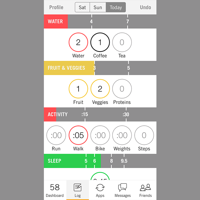
This is what the Log Screen looks like when new data is being added. The first thing you may notice is the color system we've seen throughout, which again indicates to the user in which segments of their healthy lifestyle they are doing well, and which they can improve.
The difference here is context, timeframe in particular. We're now looking at healthy choices made within the scope of a single day, making this is much more granular feedback.
Furthermore, in this view I can see the breakdown of those color tiers in detail for each segment - for example I can see that 3 servings of fruits and veggies is the minimum threhold for yellow, and 5 servings for green.
Now I have specific goals in mind, and I can get satisfaction out of turning these meters from red, to yellow, and to green each day.
So how does this stack up against a detail layer in Nudge Coach?
Here is an example of a "detail layer" in Nudge Coach. What makes the context of this layer different from the "summary layer" view in this system is primarily that this entire view is habit-specific, meaning in this case that it focuses entirely on exercise data.
The core context change in going from Summary Layer to Detail Layer in Nudge Coach is a move from a broader set of actions to more action-specific, and in Nudge we go from a broader timeframe to more timeframe-specific.
Some of the details that show up here include a y-axis showing us thresholds where users move into new color categories. Above we're just looking at steps, and we can see that a user goes from red to yellow at 5,000 steps, and then to green at 10,000 steps.
It's also important to note that we see a full 30-days of data as a coach. The value a coach gets from being able to monitor and identify trends in client habits over time is substantial.
When patterns emerge, coaches can intervene to find out why some days of the week may be better than others, and develop strategies for increasing consistency across the board.
You also may have noticed that little toggle at the top of this screenshot. Now we're looking at a view we've labeled "Cardio" in Nudge Coach.
This view lets a coach go one step deeper still to differentiate between actual consecutive bouts of exercise, and casual or passively tracked movement during the course of a day.
On this graph we see only the data classified as single bouts of exercise filled in with the standard color feedback system, while passive movement throughout the data is stacked on top of those graphs in the form of hatched bars.
Any health professional will tell you that this is an important distinction. It's incredibly helpful to know when clients are actually getting that run in to get their heart rate up for an extended period, and when they're just moving around a lot within the context of normal daily activities.
There's that word again. One more time... CONTEXT.


